Their writing or newly chosen words
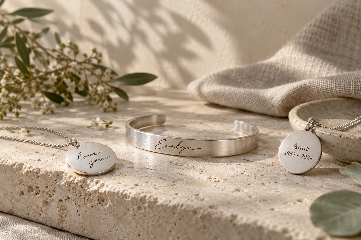
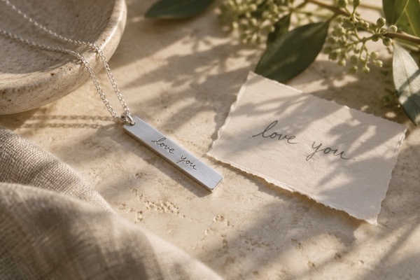
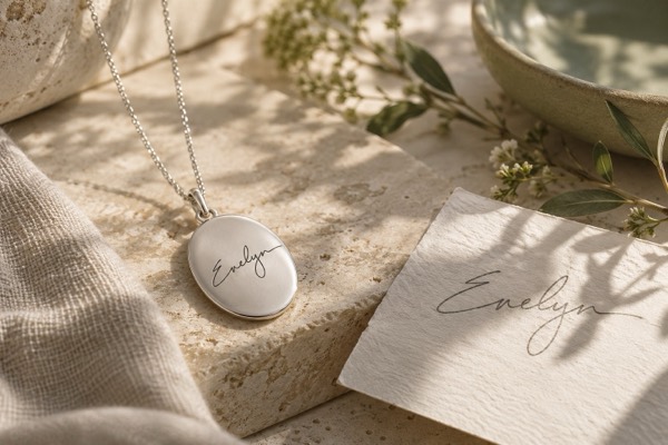
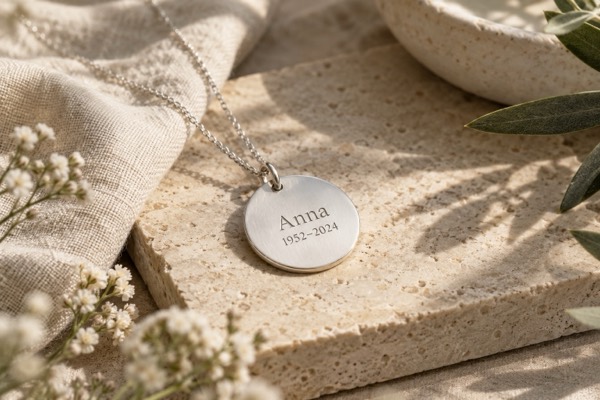
Copying handwriting preserves the shapes of the original letters. Standard engraving uses text you supply in a chosen typeface. Neither is inherently more personal; they preserve different things. If the way the words look is part of the memory, use a source-led approach and ask about faithful reproduction.
A message in their handwriting
A phrase from a letter or card can keep someone’s voice close. Choose a passage with meaning on its own and think about the space available. A shorter extract may remain clearer at jewellery scale than a whole sentence squeezed into a small area.
A signature or simple inscription
A signature is a distinctive personal mark, including flourishes and unusual spacing. A name or date supplied as new text does not need a source image and may be easier to adapt to a small surface. Consider privacy and visibility when choosing front, reverse or inside placement.
Space and legibility
Text length, letter thickness and the shape of the jewellery affect the finished result. An enlarged digital proof can make tiny lettering look deceptively generous. Ask to view the layout at approximately its finished size and confirm what can still be changed before making begins.
Prepare the words you want to keep
Preserve the original document and prepare a clear copy of the chosen area. Remove unrelated personal details from the copy if appropriate, keeping your own full record. For new wording, check every character carefully, including punctuation, accents and date format, before the maker prepares the final design.
Questions you might have
Is handwriting jewellery different from ordinary engraving?
Yes. Handwriting reproduction uses a particular person’s letterforms; ordinary text engraving can use a standard font. Ask which method the design uses.
Can I use words from several cards?
It may be possible, but combining extracts changes the source. Ask for a transparent proof showing how the pieces have been arranged.
How much text can fit?
There is no universal limit. Surface size, lettering style and method matter, so ask for a readable layout rather than a maximum character count alone.